Product Design
Booking Options Experience
The business wanted to introduce multiple booking rates, giving customers greater flexibility in how and when they pay for their accommodation while creating new commercial opportunities across the booking experience.
I led the end-to-end product design process to transform this added complexity into a clearer customer decision, validating the language, interaction model and booking experience through moderated usability testing before development.
Weeks Design Process
Participants Moderated Usability Testing
Stakeholder Groups
Rate Approaches Validated


Problem
The initial brief was to introduce multiple booking options using an established rate structure and internally defined terminology.
Before designing the interface, I recommended to the Product Managers to step back and first review the broader customer experience. The inital rate names and conditions had been designed from a product perspective, but they didn't reflect how customers evaluate booking decisions. By reframing the problem first, we could simplify not only the interface, but also the language customers relied on to understand payment, flexibility and cancellation.
Without addressing this first, introducing more booking options would simply increase complexity, leading to greater cognitive load, hesitation and potential abandonment during the booking journey.
My role
I led the design process across Product, Engineering and executive stakeholders during a six-week design phase.
My role extended beyond interface design.
I challenged the inherited terminology as part of the end-to-end desktop and mobile experience, then conducting moderated usability testing, and translated the findings into customer-facing writing principles; established the analytics and experimentation; and governance needed for launch.
I also worked with multiple engineers to balance the intended customer experience with technical constraints while protecting the clarity of price, payment and cancellation information.
The challenge
The business objective was to introduce more booking options for customers.
However, the challenge wasn't designing additional booking options, it was ensuring customers could confidently choose between them. The proposed product structure relied on internal terminology and policy-driven conditions that increased cognitive effort at a critical decision point.
I led a broader UX approach, reframing the problem around customer understanding and using research, testing and stakeholder alignment to shape an evidence-based solution.
What I did
Product Framing
Challenged the inherited brief
Identified customer and conversion risks
Reframed the problem around decision confidence
Usability Testing
Moderated 6 user testing participants
AI Prototyping
Three realistic scenarios
Remote and in-person sessions
UX Writing
Tested three naming approaches
Defined customer-facing conditions
Established rate-writing principles
Interaction Design
End-to-end desktop and mobile flows
Rate selection and comparison
Payment, checkout and confirmation states
Stakeholder Leadership
8 structured design reviews
Product, Engineering and executives
Resolved competing priorities through evidence
Measurement and Governance
10+ Heap UX measures
3 experiment hypotheses
Product-content review checkpoints
Designing Beyond Rate Selection
Choosing a rate was only the beginning of the experience.
The selected option affected the accommodation page, booking summary, checkout totals, payment timing, confirmation messaging, reminder emails and failed-payment states.
I mapped the full journey across mobile and desktop to ensure the selected rate remained understandable and consistent throughout as customers moved from comparison to commitment, and post-booking communication.


Design Annotations
Rate options
Conditions UX Copy
Rate Option UX
Pricing UI
Evolving the Design Through Feedback
The experience moved through three major design iterations, followed by ongoing refinements through stakeholder reviews, engineering investigations and usability findings.
Each iteration tested how much information should be visible upfront, how customers should compare options and how price, payment and cancellation information should be prioritised.
Interation 1
Inherited structure
Interation 2
Improved hierarchy and comparison
Interation 3
Validated behaviour-based communication
Replacing Internal Opinions with Customer Evidence
Stakeholders held different views about how the rates should be named and presented.
To establish an evidence-based direction, I designed three interactive variants and conducted moderated sessions with six participants qualifying them taking regular holidays several times a year, as well being familiar with booking accommodations. This ensured they had an idea what to expect with conditions when making a holiday booking.
The study focused on comprehension and confidence rather than statistical significance or conversion prediction.


AI Interactive Prototype
Prototype created using AI to simulate a realistic booking experience, allowing customers to interact naturally with the prototype during moderated usability testing before development.
What the Testing Revealed
The experience moved through three major design iterations, followed by ongoing refinements through stakeholder reviews, engineering investigations and usability findings.
Each iteration tested how much information should be visible upfront, how customers should compare options and how price, payment and cancellation information should be prioritised.
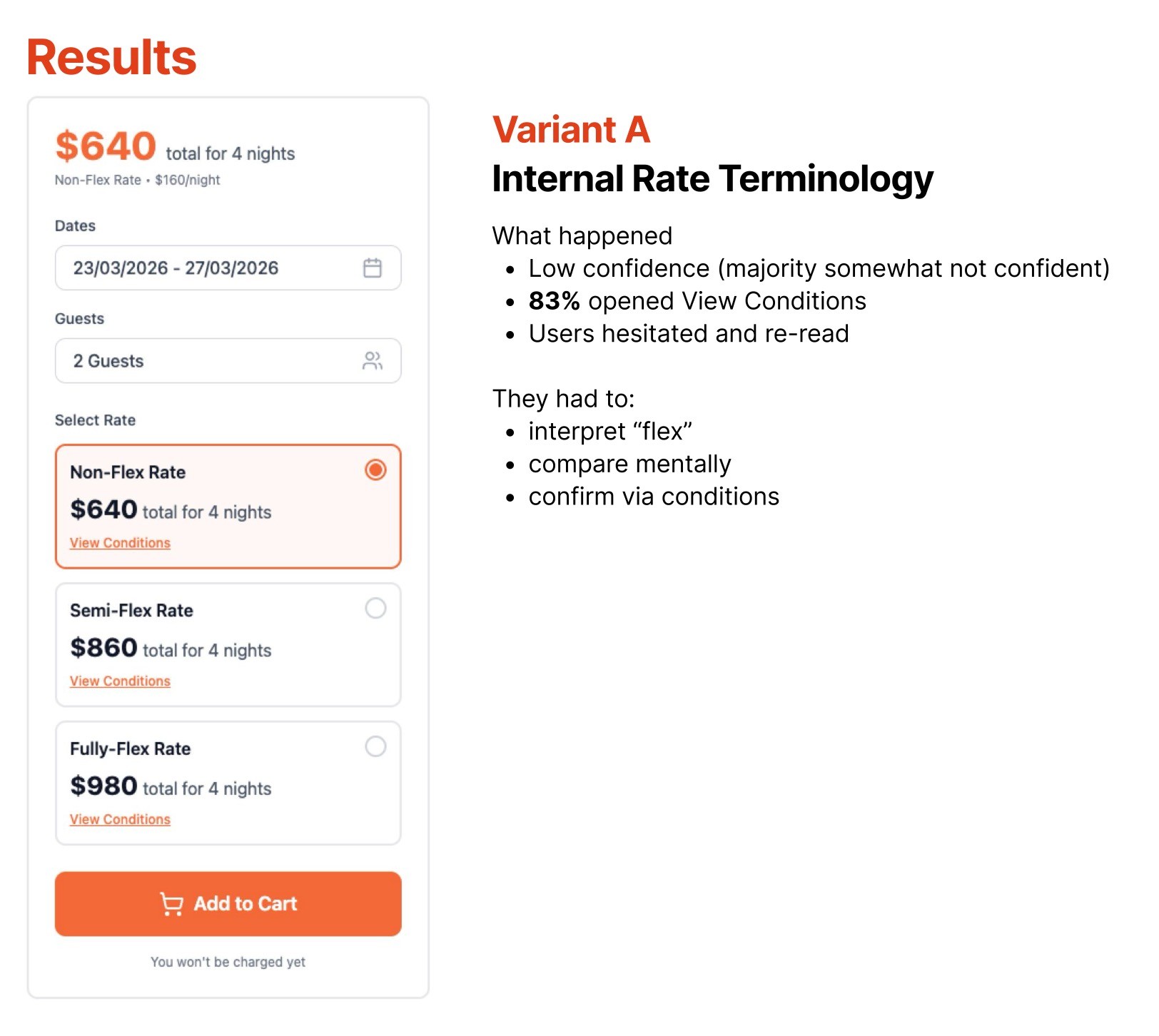
Internal Terminology
Participants hesitated, re-read options and needed to interpret what “flex” meant before confirming their assumptions.
Behaviour-Based Language
All 6 participants correctly understood the Test A timing, reported high confidence and showed no observed hesitation.
Tier Naming
Names such as Saver and Flexible sounded appealing but still required customers to translate their meaning and inspect the conditions.
3 approaches tested


The Research Changed the Question
The testing showed that customers were not simply choosing between rates.
They were evaluating how much risk they were willing to accept, when money would leave their account and whether they could trust the process if their plans changed.
Payment timing became as important as cancellation wording. Participants created incorrect mental models when information was incomplete, including assuming that “checkout” referred to leaving the property or that no payment today meant no payment until arrival.
"Customers did not want to decode a rate. They wanted to understand the risk immediately and decide how much certainty was worth paying for."

Establishing Product Standards
I translated the findings as documented UX guidelines for the team responsible for creating and configuring rate products, ensuring future rate names and conditions followed the same customer-centred principles.
Principles
Explain when payment occurs
Explain what happens if customers cancel
Use exact dates instead of requiring calculations
Translate policies into customer consequences
Surface refundability and payment timing upfront
Repeat critical information across the journey
Use progressive disclosure for detailed conditions
Avoid internal and system-driven terminology
The wider analysis established a clear principle:
communicate when customers pay and what happens if they cancel without requiring interpretation.
Measuring Customer Confidence
Throughout the design process, stakeholder reviews and usability testing, I documented opportunities to validate design decisions and customer behaviours after launch. Rather than relying solely on business KPIs, I defined a set of UX measures within Heap to understand how customers engage with the experience, where confidence increases or declines, and where further optimisation may be required.
These insights will guide post-launch iterations, ensuring future improvements are driven by observed customer behaviour rather than assumptions.
The following events and dashboards have been defined for implementation and reporting following go-live:
Do customers notice there are multiple rates?
Metric: % of sessions where a user expands/views more than one rate
Are customers comparing options?
Metric: Average number of rate cards viewed before selection
Do customers change their mind?
Metric: Rate Switch Rate (select one rate then another before checkout)
Where do customers hesitate?
Metric: Time from first rate view to rate selection
Do customers abandon after seeing rates?
Metric: Exit rate from accommodation page after rate interaction
In addition, an exit intent survey setup in Hotjar will ask directly if they had difficulties with the UX and understanding the rate details.
Multi-variant Testing
Stakeholder alternatives that were not selected were not discarded.
I converted them into three testable hypotheses for post-launch experimentation, allowing future decisions to be based on customer behaviour and conversion performance.
"Hypothesis: Making the rate conditions link more explicit will increase customer engagement with booking details, resulting in better understanding of rate conditions before reaching the payment screen."
The testing presentation itself suggests future comparisons around behaviour language, tier naming, free cancellation, flexible wording, dates versus days and option anchoring.